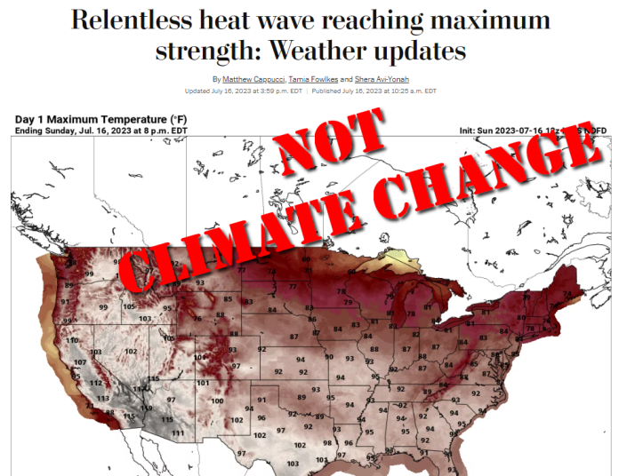
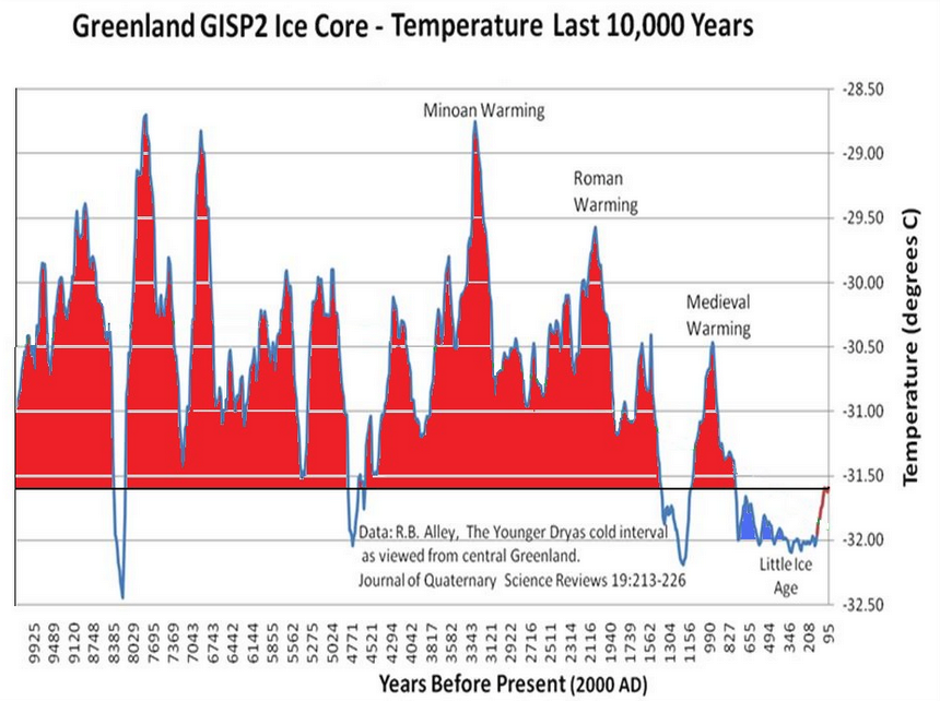
A number of media outlets are claiming that U.S. heatwaves are getting worse this week due to climate change. This is false. Actual data from temperature measurements show that heatwaves in the U.S. are on the decline even as climate change has occurred over the last 75 years.
It is summer in the Northern Hemisphere, and unsurprisingly to those that pay attention to data, it is hot in many places in the U.S. – in other words, business as usual for summer. But, the media sees climate change in every heatwave event, and seeks to exploit a connection, even though one doesn’t exist. For example, last week it was declared that the world had seen its hottest day ever on July 4, with some outlets claiming the “hottest in 100,000 years.” That of course, was proven laughably false here at Climate Realism on both counts.
This week, the media was at it again. The Washington Post, in an article titled, “Relentless heat wave reaching maximum strength: Weather updates,” says this:
“What is a heat dome? Understand the science and how drought and climate change make them worse.”
Axios, in the article “What this summer’s weather reveals about climate change” written by the ever-excitable Andrew Freedman, opines,
Monitoring the planet’s climate this summer can give one the impression that the climate system — which includes the oceans, atmosphere, ice sheets and more — has gone off the rails.
…
Climate studies have warned about an uptick in simultaneous heat waves occurring in the Northern Hemisphere.”
Then there is the “World Socialist Web Site”, with the headline: “Record-breaking US heat wave demonstrates the growing dangers of climate change.”
None of the news outlets running heat wave stories this week examined or cites historical data on heat waves, preferring instead to push scary numbers in the form of heat indexes that combine temperature and humidity, reprint the opinion of “climate scientists,” and reference computer models that suggest climate change is making heat waves worse.
Yet, data exists, for any reporter with a modicum of journalistic curiosity to find. The problem is that the data doesn’t look scary.
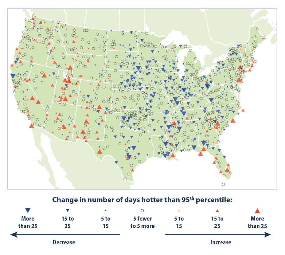
The U.S. Environmental Protection Agency (EPA) maintains a web page on heatwaves in the U.S. which contains some very interesting data and maps. Despite the claims of climate change creating worse heatwaves, the data the EPA has compiled going back to 1948 says exactly the opposite.
The data is on display in Figure 1, below.
The EPA writes:
The data come from thousands of weather stations across the United States. National patterns can be determined by dividing the country into a grid and examining the data for one station in each cell of the grid. This method ensures that the results are not biased toward regions that happen to have many stations close together.
…
[Figure 1] was created by reviewing all daily maximum temperatures from 1948 to 2020 and identifying the 95th percentile temperature (a temperature that one would only expect to exceed in five days out of every 100) at each station. Next, for each year, the total number of days with maximum temperatures higher than the 95th percentile (that is, unusually hot days) was determined. The map shows how the total number of unusually hot days per year at each station has changed over time.
The EPA’s data for 1,066 weather stations across the United States showed a total of 863 stations, or 81 percent, reporting either a decrease or no change in the number of unusually hot days. By comparison, only 19 percent of all weather stations reported an increase in the number of unusually hot days since 1948.
Many of the stations showing hotter temperatures over the 1948-2020 period were located at airports or otherwise badly sited locations that created heat biases such as reported by the study Climate Realism covered last year, Corrupted Climate Stations: The U.S. Temperature Record Remains Fatally Flawed. As reported in that study, much of the upward heat bias occurs in the minimum overnight temperature at these weather stations, enabling them to reach higher than expected daytime high temperatures had they not had a “head start” from the warmer than expected overnight low.
In fact, you can see this issue on display using maximum and minimum data for all weather stations in the U.S. Figures 2A and 2B below show maximum and minimum temperatures in the U.S. from 1948, so that it matches the start of EPA data in Figure 1.
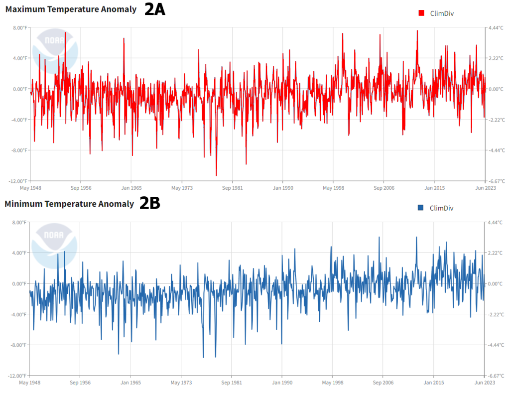
In figure 2A, you can see the maximum temperatures (the sort of temperatures that would occur in a heat wave) have not changed much since 1948. In fact, there are spikes of high temperatures in the U.S. in 1954 and in 1963 that are higher than the present day.
In figure 2B, you can see the minimum temperatures have had a slow and steady rise since 1948, with peaks in the last 20 years (warmer nights) being higher than values in the 1940s and 1950s.
Finally, another graph from the EPA shows that heat waves were actually the worst for the U.S. in the 1930s, well before climate change became a blip on the media radar. See Figure 3.
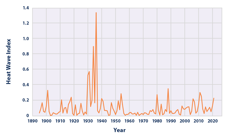
The bottom line is this: despite what the media says, real-world data shows heat waves are NOT getting worse in the United States due to climate change. This flies in the face of opinions by climate scientists cited in the mainstream media which seems wedded to the narrative that climate change is causing a crisis, despite data to the contrary.

