Special to Climate Depot
By Christopher Monckton of Brenchley
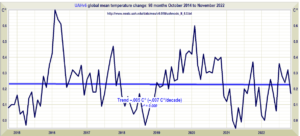
The only reliable global-temperature database, the University of Alabama at Huntsville’s satellite record kept by Dr John Christy and Dr Roy Spencer, who designed, built and operate the satellites and process and publish the data, is exactly 44 years old this month. It shows there has been no global warming throughout the last 8 years 2 months. During almost the entire period since the previous IPCC report in 2013, the world has not warmed at all:
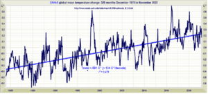
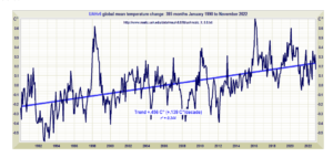
The long-run rate of warming continues to be well below the 0.3 C°/decade (p. xi) to 0.34 C°/decade (p. xxiv) predicted by IPCC (1990) on its business-as-usual Scenario A. IPCC’s excitable over-prediction, on which the global warming scare was founded, has proven to have exceeded the 0.134 C°/decade outturn two and a half times over:
The UAH database is the best of them all for many reasons. First and foremost, John Christy and Roy Spencer have two qualities all but unknown in the slimy subject that is climatology. They are strikingly competent, and they are strikingly honest.
Secondly, their dataset is more reliable than the other satellite dataset, that of Remote Sensing Systems Ltd. Dr Ray Mears, responsible for the RSS data, has declared his prejudice by describing those who are not climate Communists as “deniers”, a malevolent word with deliberate overtones of comparison with Holocaust denial. He is not, therefore, an honest broker. Furthermore, his dataset relies on an outdated version of one of the satellite records that is known to be defective and has long been replaced in the UAH dataset.
Thirdly, the terrestrial temperature datasets, unlike the satellite datasets, are heavily contaminated by the urban heat-island effect, which makes global warming look a lot more rapid than it is in reality.
It now looks likely that we are in for a three-year la Niña. Since la Niñas tend to reduce warming, it may well be that the present Pause will reach nine or ten years before the next el Niño causes the slow, gentle, harmless and net-beneficial global warming rate to resume.
Joe D’Aleo got in touch recently to draw my attention to a silly “fact-check” of my studies on the new Pause. The perp is one “Zeke” Hausfather, who, in his old age, becomes more and more apoplectic that the likes of Monckton, who have had their reputations more systemically attacked than almost anyone, are still standing notwithstanding, and still exercising the ancient right of free speech that foreign powers pay the tech giants so handsomely to suppress.
How’s-yer-father’s piece has apparently pooped up at a number of sites nobody reads, which is why I had not come across it until Joe found it and asked for my comments. So here goes.
The blurb above the “fact-check” says that Auld Grouchie is fact-checking my “claims that global warming has ‘paused’ over the last eight years.”
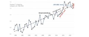
The key graph is shown above. I have preserved its revealing aspect ratio, a standard dodge among the Thermageddonites, which makes it look as though there has been a terrifyingly steep increase in global temperature rather than an increase of 1.3 C°, or less than 0.5% absolute, since the late 19th century.
Two can play at that game. All we have to do is use the magic of modern technology to demonstrate a far less alarming aspect ratio:
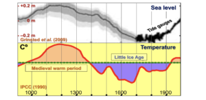
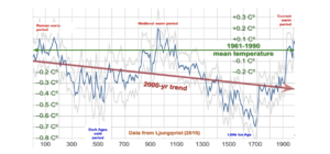
Then we are given a standard fanatical line: “The last eight years are the warmest eight years since records began in the mid-1800s.” Except that records began a lot further back than that. Here, for instance, is my medal-winning comparison between Grinsted’s reconstruction of sea-level rise over the past 1100 years with Hubert Lamb’s reconstruction of global mean surface temperatures over the same period. Alfred Wegener would have liked the correlation.
The Medieval Warm Period that the denizen of Penn State (or should those two words be transposed?) so ingeniously tried to abolish with his Hokey-Stick cartoon is revealingly present in both records. The Warm Period (I remember it well) was warmer than the year 2000. That was why we were able to build the great cathedrals of Britain and Europe.
Here is another record of global temperature changes, this time stretching back to the year dot. It was as warm in 100 AD as in 2000.
Again, the peak temperature of the medieval warm period is shown as warmer than the year 2000. Yet the planet somehow survived.
Next, the Great Fact-Chucker tells his few readers that the Great Pause of 1997-2015, lasting almost 19 years, was “a small variation on a relentlessly upward trend in temperatures”. Well, the 2008 NOAA State of the Climate report said that any zero trend of 15 years or more would indicate that the models were wrong. Ergo, the models were wrong.
Then, “There is no evidence that the past eight years were in any way unusual and the hype around – and obvious end of – the prior ‘pause’ should provide a cautionary tale about over-interpreting year-to-year variability today.”
Except that I don’t “over-interpret”. I merely report that, yet again, a longish Pause in global mean surface temperatures is building up. It’s a fact. The previous Pause endured for nearly 19 years. But the far Left don’t like mere facts when they run counter to the Party Line.
Next, the Cherry-Picker of Cherry-Pickers cherry-picks, and admits he is cherry-picking, a period starting with a la Niña and ending with an unusually strong el Niño – 2011-2018 – which suggests that global warming has “massively accelerated to a rate of 5.6 C° per century”.
Of course, Zeke the Geek says I’m cherry-picking too. Except that I’m not. My graph is calculated, not arbitrarily selected. I work back from the present and see how long a zero trend there is. At the moment it is 8 years 2 months and counting.
What all the Pause-deniers fail to admit is that, as these frequent long Pauses suggest, the long-run warming rate is far less than predicted and is not only harmless but net-beneficial.
It is particularly revealing to compare the rate of warming predicted by IPCC in 1990 on its business-as-usual Scenario A with the rate of warming that has happened in the real world since 1990.
Note also that the warming rate of 0.139 C°/decade from 1990 to the present is more or less identical to the warming rate of 0.134 C°/decade from 1978 to the present. The rapid acceleration in warming predicted by the models is simply not happening.
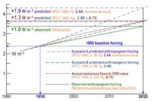
Whenever I point out that the warming rate is less than predicted, the whining trolls complain that we should not be judging IPeCaC by its business-as-usual emissions Scenario A. Instead, they say, we should be judging it by emissions Scenario B. Let us nail that one on the head once and for all.
As the next diagram shows, the crucial fact about emissions scenario B is that the resultant 1.3 W m–2 anthropogenic change in forcing from 1990-2025 was predicted to be near-coincident with the change in forcing that predicted by IPCC on the basis that the world had held its sins of emission at 1990 levels.
But the world went on sinning. Emissions have risen sharply compared with 1990. Therefore, Scenario A is indeed the closest scenario to the actual emissions that have occurred since 1990 – particularly for CO2, which accounts for two-thirds of all anthropogenic forcing. It’s as simple as that.
But why do these long Pauses in global temperature matter? It is not just that the Pauses graphically illustrate the fact that the real-world rate of warming is a great deal less than the rate that was originally predicted, and illustrate it in a way that everyone can understand.
The real-world temperature record – practically never mentioned in the Marxstream media because the inconvenient truth is that it is proving to be as good for the planet as it is small – is the key to calculating just how much (or, rather, how little) global warming the world could prevent if every country on Earth moved in a straight line from here to global net zero emissions by 2050. But that is a story for another column. Watch this space.

