German public television is splashing red on its weather forecast charts to make people think it’s hot.
At Facebook, Akinom Dnagiew posted two fascinating side-by-side weather charts used by German ARD public television for weather forecasting:

“Do you feel manipulated.” Image: ARD
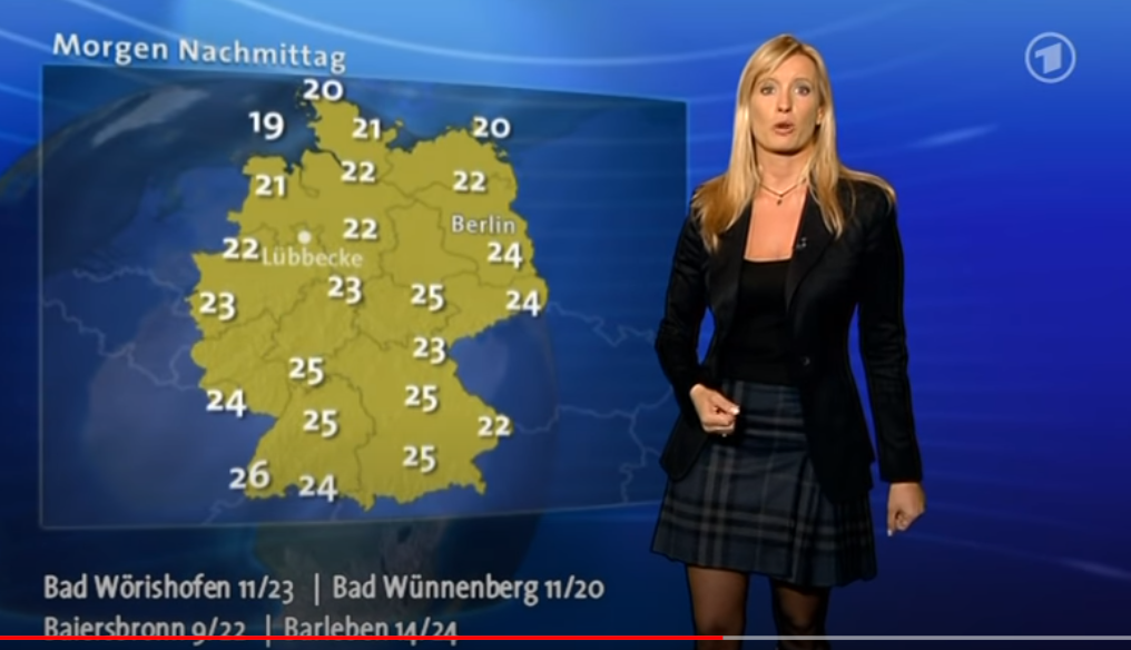
Readers will notice how in 2009 a calm, neutral chart was used for showing the day’s high temperatures, in Celsius. But then 10 years later, in 2019, the ARD was using more dramatic and aggressive color scheme to represent temperatures. Now it seems to be hot even when it’s relatively cool!
In 2009, in northeast Germany, 27°C is shown without red hot colors. Then in 2019, even a relatively cool 22°C (72°F) gets shown as red hot.
The German title of the above chart reads: “Fühlen Sie sich manipuliert?” (“Do you feel manipulated?”
Looking at the chart from 2009, one sees the temperatures figures are high, yet we don’t get a hot visual impression. In 2019, on the other hand, a viewer way up in northern Germany might even start sweating a little bit from all the hot looking red, even though the high is expected to be only 20°C (68°F).
Other examples
What follows is a forecast chart from 2014 on ZDF public television:
Here in the above video you’ll see that 25°C is designated by a light orange, and not dark red.
What follows next is a screen shot from an ARD weather forecast made in 2008:
Above we see a low key chart in plain green. No psychological color manipulations. – just the numbers.
Taming the red?
Okay, but let’s be fair. This year it seems the ARD has tamed its red colors somewhat. What follows is an image from today’s weather forecast:
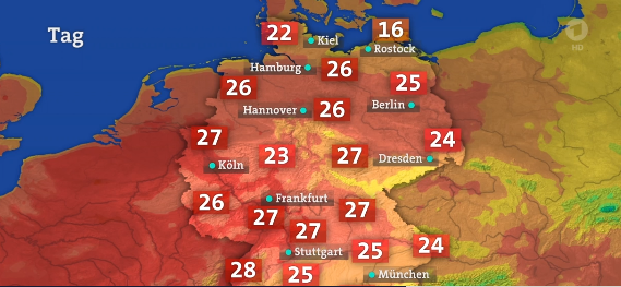
Temperatures in the mid 20s are now shown as light red. Image cropped from the ARD tagesschau.de.