https://cei.org/blog/are-hurricanes-becoming-blow-hards

Last month, as Tropical Storm Imelda slowly dissipated over south Texas, creating yet another Texas-sized flood, I read an article in Business Insider making the remarkable claim that “warming overall makes hurricanes more frequent and devastating than they would otherwise be.”It’s in the present tense: “makes.” Given that words have meaning, there must be some relationship between global surface temperature, hurricane frequency, and devastation, no? At least that would be a good (and testable) hypothesis. And, having published a bit in the scientific literature on these storms, I thought I’d do some testing.
We have a lot of data on these storms. Generically, hurricanes are tropical cyclones—low pressure areas that (mostly) originate in the tropical trade winds and, as they strengthen, develop a low pressure core that is warmer than their surroundings. This serves to draw more and more air towards the center, converging it in the form of huge rainy storms that release more heat—and the race is on, sometimes all the way to Category 5. The more pedestrian frontal cyclone of the mid and higher latitudes is cold-hearted and actually more complicated, and in general, a great deal less destructive.
Thanks to that destructive potential, tropical cyclones were one of the reasons for the great push to develop global weather satellite coverage. By 1970, we could surveil the entire domain where hurricanes roam, so we know both the track and the intensity of every one since then. It then devolves upon someone with a lot of patience to sort through all that imagery and catalog the time-intensity history of dreaded tropical cyclones.
That’s what Dr. Ryan Maue does for fun, besides being a crack-shot weather forecaster and perhaps the world’s greatest graphic artist when it comes to presenting weather data. Look him up on that gauche Twitter thingy.
So Ryan multiplies the square of the wind speed by the length of time that those winds blow to calculate the power of individual storms, which he can then add up through each season, each ocean, each hemisphere and up to the globe to develop the regional, hemispheric, and global “Accumulated Cyclone Energy” (ACE) Index. Here it is:
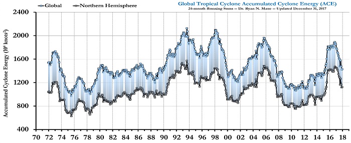
Figure 1. Maue’s Accumulated Cyclone Energy Index. Top: Global; Bottom: Northern Hemisphere; Shaded: Southern Hemisphere. 24-month running means.
The ACE history bears little resemblance to what’s been happening with surface temperatures. Sure, temps rose about a half of a degree Celsius from the late 1970s through the late 1990s, but they most certainly did not fall back to their late 70s values by the early 21st century, rise again a few years later, and then fall at the end of the first decade of the century, etc. The fairest thing we can say is there is no apparent relationship between integrated global tropical cyclone energy and global surface temperature.
But wait—let’s look at Atlantic hurricanes only. After all, they’re the ones that hit the U.S. In its third (2014) “National Assessment of Global Climate Change Impacts on the United States,” the U.S. Global Change Research Program (USGCRP, a consortium of all the 13 federal entities that consume your money in the name of climate science and propagandistic graphics) shows a sidebar related to Maue’s ACE index, called the Power Dissipation Index. That’s a product of MIT’s Kerry Emanuel (Emanuel cubes the wind speed while Maue squares it, so Emanuel’s index inflates more). The data began in 1970 and ended in 2009, and the Hollywood illustrators (I am not making this up) at USGCRP drew a fat red upward pointing line from 1982 through 2009.
There is a longer record of Atlantic hurricanes, put together by the aptly named Dr. Chris Landsea of the National Hurricane Research Laboratory. It goes back to 1860, but surely there are some missed prior to World War II, so the early years are likely an undercount. Just to be safe, Ryan Maue calculated Emanuel’s index back to 1920.
Just for the heck of it, I colored in red the same area that the USGCRP’s artists did.
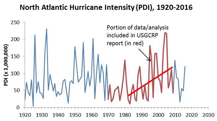
Figure 2. North Atlantic Hurricane Power Dissipation Index. Calculation by Dr. Ryan Maue on data from the National Hurricane Research Laboratory. Data in Red were highlighted in the 2014 National Assessment of Climate Change Impacts on the United States. The remaining data are from Dr. Chris Landsea of the National Hurricane Research Laboratory.
You will notice two things.
First, the reason the USGCRP data ended in 2009 (they could have ended in 2013 for their 2014 report) was that the years 2011-2013 wrecked their red-line narrative of an unusual increase in intensity.
Second, there was clearly a period, from around 1940 through 1965 or so when the Power Dissipation Index increased just like it did from 1982 to the magic year of 2009. So there was nothing unusual going on in the USGCRP’s cherry-picked data.
In closing, I should mention that this is the kind of “science” that is cited as a reason that carbon dioxide emissions “endanger” human health and welfare. Maybe it’s time to put their endangerment finding in danger.