
Special to Climate Depot
Global Temperature Update
It’s official: no global warming for 18 years 1 month
By Christopher Monckton of Brenchley
The RSS monthly satellite global temperature anomaly for September 2014 is in, and the Great Pause is now two months longer than it was last month. Would this year’s el Niño bite soon enough to stop the psychologically-significant 18-year threshold from being crossed? The official answer is No.
Globally, September was scarcely warmer than August, which was itself some distance below the 18-year trend-line. Therefore, taking the least-squares linear-regression trend on the RSS satellite monthly global mean surface temperature anomalies, there has now been no global warming for 18 years 1 month.
Dr Benny Peiser, our good friend at the Global Warming Policy Foundation in the UK, had anticipated the official crossing of the 18-year threshold by a day or two with an interesting note circulated to supporters on the ever-lengthening period without any global warming, and featuring our 17-years-11-months graph from last month.
The Great Pause is the longest continuous period without any warming in the global instrumental temperature record since the satellites first watched in 1979. It has endured for a little over half the satellite temperature record. Yet the Pause coincides with a continuing, rapid increase in atmospheric CO2 concentration.
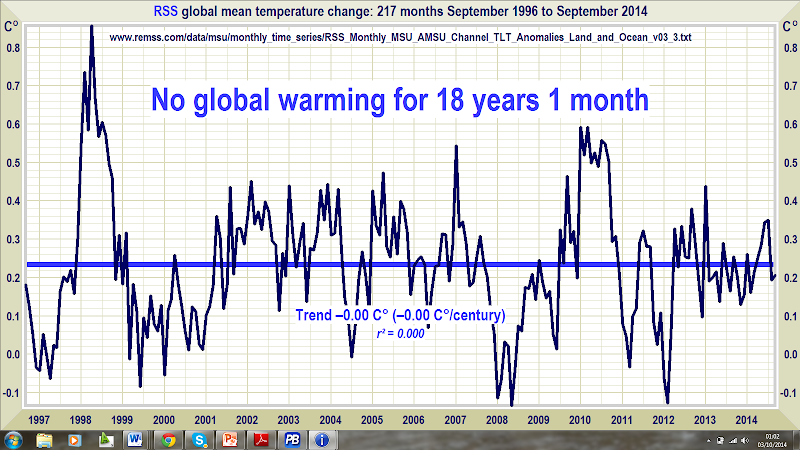
Figure 1. RSS monthly global mean lower-troposphere temperature anomalies (dark blue) and trend (thick bright blue line), September 1996 to September 2014, showing no trend for 18 years 1 month.
The hiatus period of 18 years 1 month, or 217 months, is the farthest back one can go in the RSS satellite temperature record and still show a sub-zero trend.
RSS itself is now taking a serious interest in the length of the Great Pause. Dr Carl Mears, the senior research scientist at RSS, has a long and intriguing discussion of the Pause, and of the widening divergence between the models’ excitable predictions and the mundane reality in the RSS blog, at remss.com/blog/recent-slowing-rise-global-temperatures.
Dr Mears’ results are summarized in Fig. 2:

Figure 2. Output of 33 IPCC models (turquoise) compared with measured RSS global temperature change (black), 1979-2014. The transient coolings caused by the volcanic eruptions of Chichón (1983) and Pinatubo (1991) are shown, as is the spike in warming caused by the great el Niño of 1998.
Dr Mears writes:
“The denialists like to assume that the cause for the model/observation discrepancy is some kind of problem with the fundamental model physics, and they pooh-pooh any other sort of explanation. This leads them to conclude, very likely erroneously, that the long-term sensitivity of the climate is much less than is currently thought.”
Dr Mears’ regrettable use of the word “denialists”, with its deliberate overtones of comparison with Holocaust deniers, reveals Dr Mears as what we may call a “liarist” – one who is prone to push the evidence in the profitable direction of greater alarm than is scientifically justified.
Interestingly, therefore, the RSS data, which show less recent warming than all other datasets, are under the management of a liarist, while the UAH data, which (until v. 6 becomes available at any rate) continue to show more warming than the others, are managed by sceptics.
Dr Mears admits the discrepancy between the RSS data and the models’ exaggerations, but he echoes various trolls here in alleging the supposed “cherry-picking” of the start-date for the global-temperature graph:
“Recently, a number of articles in the mainstream press have pointed out that there appears to have been little or no change in globally averaged temperature over the last two decades. Because of this, we are getting a lot of questions along the lines of ‘I saw this plot on a denialist web site. Is this really your data?’ While some of these reports have ‘cherry-picked’ their end points to make their evidence seem even stronger, there is not much doubt that the rate of warming since the late 1990s is less than that predicted by most of the IPCC AR5 simulations of historical climate. … The denialists really like to fit trends starting in 1997, so that the huge 1997-98 ENSO event is at the start of their time series, resulting in a linear fit with the smallest possible slope.”
It is time to deal with this nonsense about start-dates very firmly. The spike in temperatures caused by the Great el Niño of 1998 is largely offset in the linear-trend calculation by two factors: the spike of the 2010 el Niño, and the sheer length of the Great Pause itself.
To demonstrate this, I replaced all the monthly RSS anomalies for 1998 with the mean anomaly value of 0.55 K that obtained during the 2010 el Niño. Then I recalculated the trend from September 1996 [not Dr Mears’ “1997”] to September 2014. All that happened is that the trend values “–0.00 C° (–0.00 C°/century)” shown in the unaltered data (Fig. 1) became “+0.00 C° (+0.00 C°/century)” in the recalculated graph. Not exactly a major difference. That is the end of that climate-liarist canard.
The length of the Great Pause in global warming, significant though it now is, is of less importance than the ever-growing discrepancy between the temperature trends predicted by models and the far less exciting real-world temperature change that has been observed.
IPCC’s First Assessment Report predicted that global temperature would rise by 1.0 [0.7, 1.5] Cº to 2025, equivalent to 2.8 [1.9, 4.2] Cº per century. The executive summary asked, “How much confidence do we have in our predictions?” IPCC pointed out some uncertainties (clouds, oceans, etc.), but concluded:
“Nevertheless, … we have substantial confidence that models can predict at least the broad-scale features of climate change. … There are similarities between results from the coupled models using simple representations of the ocean and those using more sophisticated descriptions, and our understanding of such differences as do occur gives us some confidence in the results.”
That “substantial confidence” was substantial over-confidence. A quarter-century after 1990, the outturn to date – expressed as the least-squares linear-regression trend on the mean of the RSS and UAH monthly global mean surface temperature anomalies – is 0.34 Cº, equivalent to just 1.4 Cº/century, or exactly half of the central estimate in IPCC (1990) and well below even the least estimate (Fig. 3).

Figure 3. Near-term projections of warming at a rate equivalent to 2.8 [1.9, 4.2] K/century , made with “substantial confidence” in IPCC (1990), January 1990 to August 2014 (orange region and red trend line), vs. observed anomalies (dark blue) and trend (bright blue) at less than 1.4 K/century equivalent, taken as the mean of the RSS and UAH satellite monthly mean lower-troposphere temperature anomalies.
The Great Pause is a growing embarrassment to those who had told us with “substantial confidence” that the science was settled and the debate over. Nature had other ideas. Dr Mears, rightly, says the Pause is probably attributable to several factors rather than one. But the one factor he hastily rules out is any major error in the physics of the models.
Though more than 50 more or less implausible excuses for the Pause are appearing in nervous reviewed journals, the possibility that the Pause is occurring because the computer models are simply wrong about the sensitivity of temperature to manmade greenhouse gases can no longer be dismissed.
Remarkably, even the IPCC’s latest and much reduced near-term global-warming projections are also excessive (Fig. 3).

Figure 4. Predicted temperature change, January 2005 to August 2014, at a rate equivalent to 1.7 [1.0, 2.3] Cº/century (orange zone with thick red best-estimate trend line), compared with the observed anomalies (dark blue) and zero real-world trend (bright blue), taken as the average of the RSS and UAH satellite lower-troposphere temperature anomalies.
In 1990, the IPCC’s central estimate of near-term warming was higher by two-thirds than it is today. Then it was 2.8 C/century equivalent. Now it is just 1.7 Cº equivalent – and, as Fig. 4 shows, even that is proving to be a substantial exaggeration.
On the RSS satellite data, there has been no global warming statistically distinguishable from zero for more than 26 years. None of the models predicted that, in effect, there would be no global warming for a quarter of a century.
The Great Pause may well come to an end by this winter. An el Niño event is underway and would normally peak during the northern-hemisphere winter. There is too little information to say how much temporary warming it will cause, though. The temperature spikes of the 1998, 2007, and 2010 el Niños are evident in Figs. 1-4.
El Niños occur about every three or four years, though no one is entirely sure what triggers them. They cause a temporary spike in temperature, often followed by a sharp drop during the la Niña phase, as can be seen in 1999, 2008, and 2011-2012, where there was a “double-dip” la Niña that is one of the excuses for the Pause.
The ratio of el Niños to la Niñas tends to fall during the 30-year negative or cooling phases of the Pacific Decadal Oscillation, the latest of which began in late 2001. So, though the Pause may pause or even shorten for a few months at the turn of the year, it may well resume late in 2015 . Either way, it is ever clearer that global warming has not been happening at anything like the rate predicted by the climate models, and is not at all likely to occur even at the much-reduced rate now predicted. There could be as little as 1 Cº global warming this century, not the 3-4 Cº predicted by the IPCC.
Key facts about global temperature
- The RSS satellite dataset shows no global warming at all for 217 months from September 1996 to September 2014. That is more than half the 429-month satellite record.
- The global warming trend since 1900 is equivalent to 0.8 Cº per century. This is well within natural variability and may not have much to do with us.
- The fastest measured warming trend lasting ten years or more occurred over the 40 years from 1694-1733 in Central England. It was equivalent to 4.3 Cº per century.
- Since 1950, when a human influence on global temperature first became theoretically possible, the global warming trend has been equivalent to below 1.2 Cº per century.
- The fastest warming rate lasting ten years or more since 1950 occurred over the 33 years from 1974 to 2006. It was equivalent to 2.0 Cº per century.
- In 1990, the IPCC’s mid-range prediction of near-term warming was equivalent to 2.8 Cº per century, higher by two-thirds than its current prediction of 1.7 Cº/century.
- The global warming trend since 1990, when the IPCC wrote its first report, is equivalent to below 1.4 Cº per century – half of what the IPCC had then predicted.
- Though the IPCC has cut its near-term warming prediction, it has not cut its high-end business as usual centennial warming prediction of 4.8 Cº warming to 2100.
- The IPCC’s predicted 4.8 Cº warming by 2100 is well over twice the greatest rate of warming lasting more than ten years that has been measured since 1950.
- The IPCC’s 4.8 Cº-by-2100 prediction is almost four times the observed real-world warming trend since we might in theory have begun influencing it in 1950.
- From August 2001 to August 2014, the warming trend on the mean of the 5 global-temperature datasets is nil. No warming for 13 years 1 month.
- Recent extreme weather cannot be blamed on global warming, because there has not been any global warming. It is as simple as that.
Technical note
Our latest topical graph shows the RSS dataset for the 217 months September 1996 to September 2014 – just over half the 429-month satellite record. This is as far back as it is possible to go in the global instrumental record and find a zero trend. The start-date is not “cherry-picked” so as to coincide with the temperature spike caused by the 1998 el Niño: it is calculated so as to find the longest period with a zero trend.
Furthermore, the length of the pause in global warming, combined with the offsetting effect of the 2010 el Niño on the calculation, ensures that the distortion of the trend caused by the proximity of the 1998 el Niño to the 1996 start date for the trend is barely discernible.
Terrestrial temperatures are measured by thermometers. Thermometers correctly sited in rural areas away from manmade heat sources show warming rates appreciably below those that are published. The satellite datasets are based on measurements made by the most accurate thermometers available – platinum resistance thermometers, which not only measure temperature at various altitudes above the Earth’s surface via microwave sounding units but also constantly calibrate themselves by measuring via spaceward mirrors the known temperature of the cosmic background radiation, which is 1% of the freezing point of water, or just 2.73 degrees above absolute zero. It was by measuring minuscule variations in the cosmic background radiation that the NASA anisotropy probe determined the age of the Universe: 13.82 billion years.
The graph is accurate. The data are lifted monthly straight from the RSS website. A computer algorithm reads them down from the text file, takes their mean and plots them automatically using an advanced routine that automatically adjusts the aspect ratio of the data window at both axes so as to show the data at maximum scale, for clarity.
The latest monthly data point is visually inspected to ensure that it has been correctly positioned. The light blue trend line plotted across the dark blue spline-curve that shows the actual data is determined by the method of least-squares linear regression, which calculates the y-intercept and slope of the line via two well-established and functionally identical equations that are compared with one another to ensure no discrepancy between them. The IPCC and most other agencies use linear regression to determine global temperature trends. Professor Phil Jones of the University of East Anglia recommends it in one of the Climategate emails. The method is appropriate because global temperature records exhibit little auto-regression.
Dr Stephen Farish, Professor of Epidemiological Statistics at the University of Melbourne, kindly verified the reliability of the algorithm that determines the trend on the graph and the correlation coefficient, which is very low because, though the data are highly variable, the trend is flat.
Related Links:
