
Special to Climate Depot
No global warming for 17 years 3 months
By Christopher Monckton of Brenchley
The Long Pause just got three months longer – it’s now 17 years 3 months
The RSS monthly global mean lower-troposphere temperature anomalies for November 1996 to October 2013 had shown no global warming for exactly 204 months – the first dataset to show the full 17 years without warming specified by Ben Santer as showing the models got it wrong.
After the sharp global cooling in November, the RSS data for September 1996 to November 2013 show no global warming at all for 17 years 3 months, despite a continuing record rate of increase in CO2 concentration.
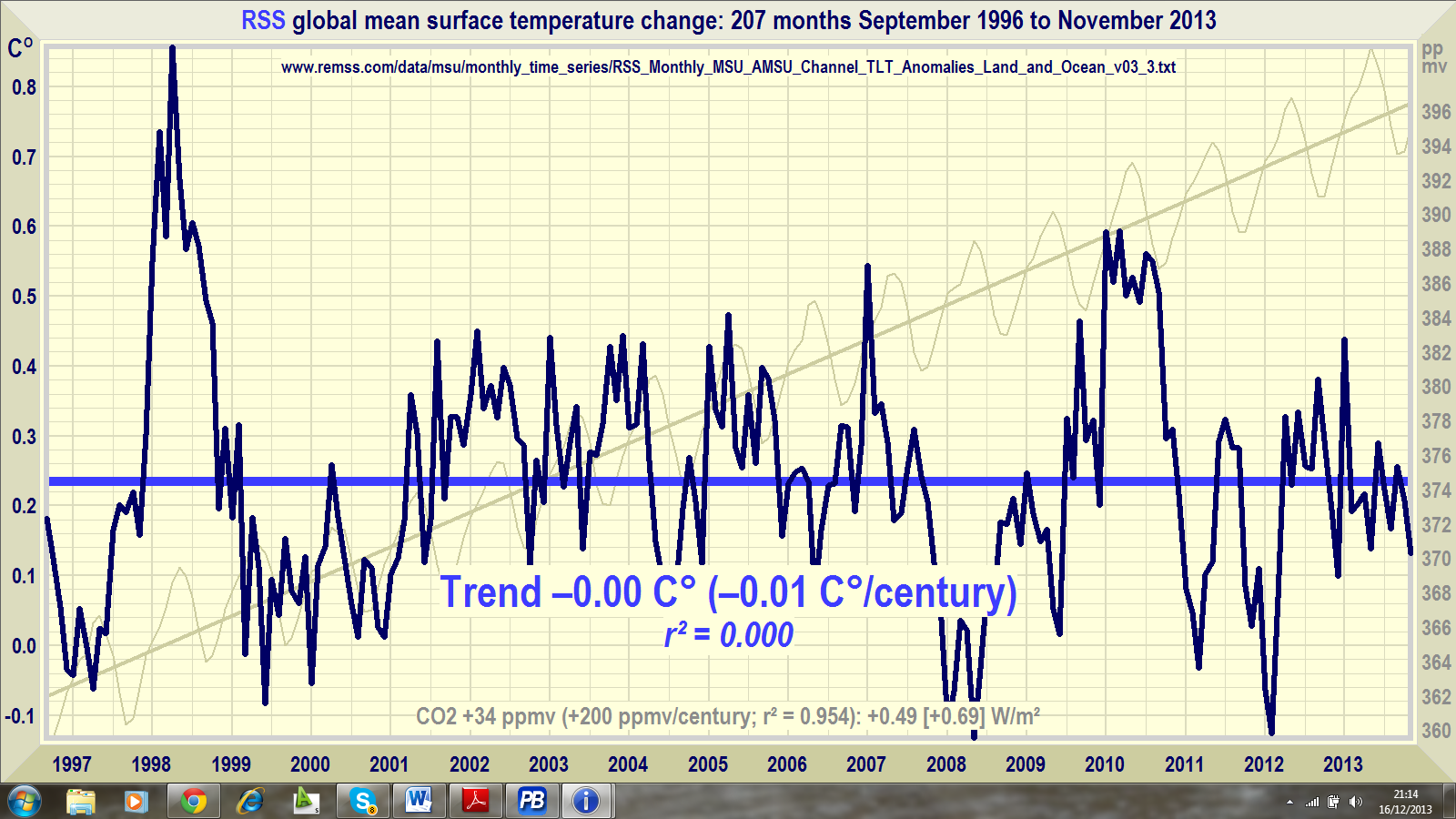
The models are badly underestimating the magnitude of natural influences on global temperature, not the least of which is the recent decline in solar activity. They are also badly overestimating the warming effect of CO2.
Since CO2 does cause some warming. it is more likely than not that global warming will return eventually. Not at anything like the predicted rate, but it will return.
It is prudent, then, to look not only at the now embarrassingly lengthening Long Pause, which a sufficiently energetic El Niño could bring to an end, but also at the now embarrassingly widening Gaping Gap between the +0.23 Celsius/decade the models predict for the first half of this century and the –0.02 Celsius/decade that is actually happening. The Gaping Gap is likely to remain, and to widen, even if global warming resumes.
How much warming does the IPCC predict?
Before we get to the Gaping Gap graph and the Global Warming Prediction Index that is calculated from it, we first establish exactly how much global warming the most recent IPCC Assessment Report predicts.
It is this prediction that will be benchmarked against measured real-world temperature change.
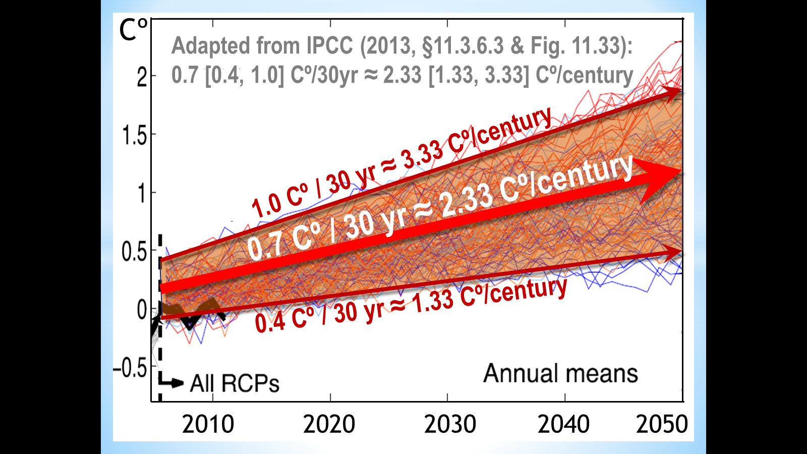
The diagram above is an adaptation of Figure 11.33ab of the IPCC’s 2013 Fifth Assessment Report, which backcasts to January 2005 the combined global-warming projections of up to 34 computer models under each of four radiative-forcing scenarios.
The diagram shows the models predict the world will warm till 2050 at a rate equivalent to 0.13-0.33 Cº/decade (central estimate 0.23 Cº/decade), or 1.33-3.33 Cº/century (central estimate 2.33 Cº/century).
The range of projected warming, 0.4-1.0 Cº over 30 years (again equivalent to 0.13-0.33 Cº/decade or 1.33-3.33 Cº/century), is also explicitly stated at paragraph 11.3.6.3 of the Fifth Assessment Report.
So there is no doubt about how much warming the models relied upon by the IPCC are predicting. Till 2050, they are predicting warming equivalent to 2.33 Cº/century. This is below the 3.3 Cº/century they predict till 2100 because they imagine the rate of global warming will accelerate in the second half of the century.
The monthly Gaping Gap graph
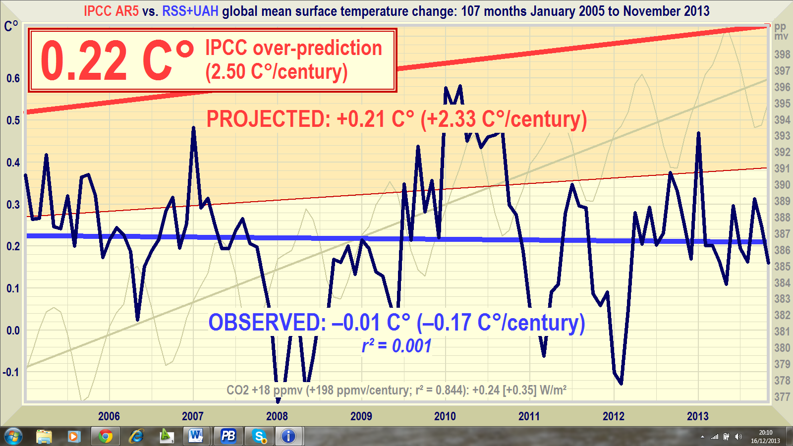
The Gaping Gap graph displays the IPCC’s range of projections of global warming as an orange region, equivalent to the region bounded by the two dark red trend arrows in the IPCC’s diagram shown earlier.
The IPCC’s mid-range prediction, the thick red line, is that the world should have warmed by 0.21 Cº since January 2005, equivalent to 0.23 Cº/decade or 2.33 Cº/century.
The graph directly compares that official mid-range prediction with the bright-blue trend-line on the official temperature measurements, taken as the arithmetic mean of the global mean satellite lower-troposphere temperature anomalies from Remote Sensing Systems, Inc., and the University of Alabama at Huntsville. The two datasets are downloaded in full every month so that the graph takes full account of any revisions that may have been made since the previous month.
The dark blue spline-curve shows the monthly data. The thick bright blue trend-line on the real-world data shows global cooling at 0.01 Cº since January 2005, equivalent to 0.17 Cº/century. Note how the bright red and bright blue trend-lines are diverging. With every month that passes, the IPCC’s predictions wander further and further from reality.
The lower bound of the orange region on the graph represents the 34 models’ low-end projection of future global warming: 0.4 Cº over 30 years, equivalent to 0.13 Cº/decade or 1.33 Cº/century. The thick, bright red line shows the IPCC’s central projection: 0.7 Cº global warming over 30 years, equivalent to 0.23 Cº/decade or 2.33 Cº/century. The high-end projection of 1.0 Cº global warming over 30 years, equivalent to 0.33 Cº/decade or 3.33 Cº/century, is too far above observation to be worth displaying at all.
The Global Warming Prediction Index
The Global Warming Prediction Index, calculated from the graph, reduces to a single number a direct comparison between the predicted rate of global warming since January 2005 with the measured warming rate. The monthly index number is simply the amount in Celsius degrees by which the IPCC’s most recent central projection of global warming has overshot or undershot the observed temperature trend since January 2005.
The models’ most recent predictions have overshot observed global warming by an impressive 0.22 Cº in less than nine years. That is equivalent to an overshoot of 0.25 Cº/decade or 2.5 Cº/century. The Global Warming Prediction Index is the large “0.22 Cº” in the box at top left on the graph.
The CO2 concentration record
For comparison, the CO2 concentration record, in gray, is from Mauna Loa, Hawaii. The 18 ppmv (198 ppmv/century) rise in the trend on the gray dogtooth CO2 concentration curve, plus other greenhouse-gas increases, should have caused at least 0.1 Cº warming, with the remaining 0.1 Cº from previous CO2 increases, in contrast to the global cooling of 0.01 Cº that has actually been observed since January 2005.
Note that the CO2 trend-line and the observed-temperature trend-line are also diverging at the moment. Not exactly what the models had predicted.
Look out for the Global Warming Prediction Index here every month
The Gaping Gap graph and the Global Warming Prediction Index will be here at Climate Depot at mid-month every month from now on, as soon as the satellite data for the previous month become available.
Here, for the first time, is the simplest, surest, most straightforward benchmark of the official global warming storyline. One glance tells you all you need to know.
- If you want graphs of global temperature data for any requested period from any the five principal global-temperature datasets (the HadCRUT4, GISS, and NCDC terrestrial datasets, and the RSS and UAH satellite datasets), or from the mean of any combination of the datasets. Just ask [email protected].
