By Paul Homewood

The World Meteorological Organisation says there’s a growing chance that global temperatures will break the 1.5C threshold over the next five years, compared to pre-industrial levels.
It says there’s a 20% possibility the critical mark will be broken in any one year before 2024.
But the assessment says there’s a 70% chance it will be broken in one or more months in those five years.
Scientists say that keeping below 1.5C will avoid the worst climate impacts.
The target was agreed by world leaders in the 2015 Paris climate accord accord.
They committed to pursue efforts to try to keep the world from warming by more than 1.5C this century.
This new assessment, carried out by the UK’s Met Office for the World Meteorological Organisation (WMO), says there’s a growing chance that this level will be breached.
Researchers say that the Earth’s average annual temperature is already more than 1C higher than it was in the 1850s – and will probably stay around this level over the next five years.
https://www.bbc.co.uk/news/science-environment-53342806
#
Paul Homewood comments:
The rest of the article is the usual load of drivel from Matt McGrath, including the absurd claim that there will be more storms over western Europe thanks to rising sea levels. What on earth do rising sea levels have to do with storms?
I still cannot understand the obsession with pre-industrial temperatures. For whatever reason the world has warmed up a bit since the Little Ice Age, and is a thoroughly better place to live as a result.
As McGrath notes, the world appears to be about a degree warmer than back then. So when they talk of 1.5C warming, they don’t mean from now, but from the 1850s:

https://www.metoffice.gov.uk/hadobs/hadcrut4/diagnostics.html
So they really mean half a degree of warming from current temperatures. Yet global temperatures can fluctuate by about half a degree anyway from year to year, and the El Nino year of 2016 was already pushing the 1.5C mark.
Why then should anybody be scared by the prospect of similar years in future?
Of course, the real reason for the 1.5C marker is that it sounds much scarier than 0.5C. Unfortunately for themselves, climate scientists, green activists and governments, having staked their reputations on the 1.5C mark, now find themselves in the position where it could come and go without anybody actually noticing. This would really undermine their apocalyptic threats.
This no doubt is one reason why Matt McGrath has included this chart. (It also plays a video on the BBC page. It ends with weatherman, Matt Taylor, telling us we must curb our emissions. I’m not quite sure when it became the job of a weatherman to tell the public how to live their lives!):

He no doubt hopes to scare people about increasing heatwaves, though I’m not sure why they would worry about 19 hot days in a decade?
But what about the figures? Do they reflect what has actually been happening?
A glimpse at the average maximum temperatures in summer suggests that summers are not getting hotter, as the BBC chart implies. Certainly not since 1976:
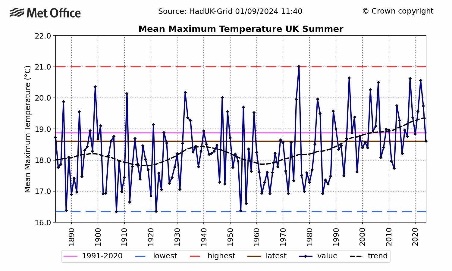
The BBC’s chart is actually pretty meaningless and misleading, as it is based on an everchanging mix of stations, many affected by UHI. As more and more sites get added to the Met Office monitoring network, the more likely it becomes that one station will record a 30C day.
And, of course, some parts of the country are naturally warmer than others, so you cannot compare a temperature at Heathrow with one in Sheffield. There is only one way to monitor trends, and that is to use a consistent database of daily temperatures. The only one we have, other than individual stations, is the Central England Temperature series.
When we analyse daily temperatures above 28C, we find:

https://www.metoffice.gov.uk/hadobs/hadcet/cetmaxdly1878on_urbadj4.dat
Decades run from 1880 to 1889, etc. I have chosen a 28C threshold, as CET tends to be a bit lower than the temperatures in the southeast, where most of the 30C days occur. But we can also do the same exercise with 30C days:

Neither chart shows any evidence that hot days are becoming more frequent, as the BBC purport to claim. Hot days in the most recent decade are less frequent than in the 1970s and 1990s. They are also not distinguishable from the 1940s.
It is worthwhile noting, however, that the BBC chart begins in the cold 1960s. It also, for no obvious reason, only considers June temperatures. Maybe a chart beginning in 1900, and using temperatures across the summer as a whole, might have yielded different conclusions!