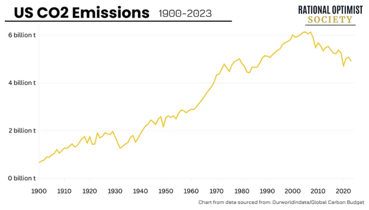
‘The president announced his Climate Action Plan aimed at mitigating future climate change by executive fiat—in other words, avoiding Congress and public opinion—and simply commanding from on high that U.S. carbon emissions be reduced (never mind that they were already declining, or that any U.S. reductions, no matter how large, would have no meaningful effect on the future course of the climate).’
…
Perhaps there is no finer example of the politicization of “science” than what the “Indicators” report the EPA just handed us.
The figure below is a portion of a screen capture from the “Heat-Related Deaths” section of the EPA’s new “Climate Change Indicators” website. It is labeled “Deaths Classified as ‘Heat-Related’ in the United States, 1979–2010.”
We don’t know anyone who could look at this chart and not be left with the strong impression that heat-related deaths in the United States are on the rise—apparently confirming the president’s concern about climate change and underscoring his desire to do something about it.

But notice the asterisk at the bottom of the box. Here’s the text associated with it:
Between 1998 and 1999, the World Health Organization revised the international codes used to classify causes of death. As a result, data from earlier than 1999 cannot easily be compared with data from 1999 and later.
In other words, you shouldn’t plot pre- and post-1999 data on the same chart because the data are not comparable, lest you mislead the uninitiated reader. The EPA ignores its own warning and instead plots the two sets of not-easily-compared data side by side on the same chart, ensuring that they are compared!
Such an analysis would probably grade out as an F in an undergraduate paper, but perhaps the EPA is suffering from a bit of “Noble Cause Corruption.” After all, they are trying to save us from certain death.
The proper way to view the EPA chart is to put your hand over the data points on the right-hand side of the chart (1999 and onwards) and then over the data points on the left-hand side of the chart (pre-1999 data). In doing so, you’ll see that during both periods the rate of heat-related mortality does not rise.


