‘Die Welt’ science editor Axel Bojanowski (right) comments “This is how climate change is forged”. He had 4 leading scientists confirm the above hockey stick chart was dubious. Image: Die Welt ,Source:: DeWikiMan/commons.wikimedia.org/CC BY-SA 4.0; Bojanowski/private
ZDF weather moderator Özden Terli under fire: Did he deceive viewers on historical climate with sleight of hand?
By Die kalte Sonne
(German text translated/edited by P. Gosselin)
Disinformation at ZDF German public broadcasting?
ZDF meteorologist Özden Terli has been a topic at this blog several times. Now ‘Die Welt’ science editor Axel Bojanowski has taken a closer look at a weather report, particularly a chart that Terli presented July 24, 2020.
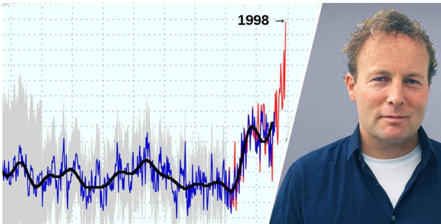
The article is behind a paywall, but is worth the money. The centerpiece is the chart from the Potsdam Institute for Climate Impact Research (PIK). It depicts a hockey stick temperature curve that is supposed to convey drama. Excerpt from the article in Die Welt:
The weather report of the “Heute Journal” on ZDF on July 24th presented something that was supposed to be sensational. Moderator Özden Terli presented a graph that allegedly showed the course of the global average temperature since the Ice Age. At first ‘the warming was very slow,’ Terli explained, ‘and then it was stable for a long time’. Suddenly, however, since around 1900, the temperature “jumped up”.
The graph showed an almost vertical red line, the peak of which far exceeded all temperatures since the Ice Age. “This jump is quite enormous,” Terli said.
Millions of viewers were shown that the present day would be warmer than all the rest of human civilization. The discovery could only be a scientific sensation, or a hoax.”
Bojanowski interviewed several experts on the subject and their reactions speak volumes because the graph cleverly mixed two things together, namely smoothed averages from the past with measured current values. Fluctuations in the past can thus no longer be seen. The experts’ verdict was unanimous: it is dubious. Bojanowski analyzes:
The graph was a sleight of hand: the steep red line at the end was not comparable to the data in the previous period. It showed annually measured average temperatures on Earth since the end of the 19th century. However, no such precise records exist for earlier times. Most of the time in the history of civilization can only be shown with average values.
Often there is only one temperature value for hundreds of years, or data has been “smoothed”, i.e. only its average value is shown – short-term warming or cooling is not shown. In order to make the period from industrialization to the present day (the steep red line) comparable with the data for the rest of the time, it should therefore only be shown as a dot showing the average temperature from 1900 to the present day – the red line would only be an inconspicuous dot.”
And because Bojanowski has been there before, the subject of drought can be brought up again. In a weather report Terli attributed this to changes in the climate system. But without going into other sources. Perhaps the weatherman would then have noticed that annual precipitation in Germany has increased over the past 120 years. … It’s astonishing that the head of ZDF Wetter, Katka Horneffer, allows Özden Terli to include such inserts in the weather report again and again.