By Richard Trzupek
On June 18, The Associated Press published a story under the byline of Seth Borenstein and Nicky Forster with the troubling headline “US Air Quality is Slipping After Years of Improvement.” While there are grains of truth in both the headline and the story that follows, there’s also a great deal of deception and ignorance in the tale Borenstein and Forster attempt to fashion.
The truth is that the changes in air quality cited are statistically insignificant, largely driven by wildfires, and do nothing to contradict claims that America’s air is as clean as it has ever been.
The metric the pair chose to use to prove that air quality is “slipping” is the Air Quality Index, or AQI. Based on a Twitter exchange Borenstein had with Junk Science founder Steve Milloy, the reporter appears to believe that use of AQI is an appropriate way to measure changes in air quality. In response to Milloy’s query whether or not tightened EPA standards were factored in, Borenstein replied, in part: “Change in air quality standards factored in. Spent weeks double checking this, other data issues w/EPA. Apples to apples comparisons.”
As an air quality professional, I do find it troubling that a reporter could spend “weeks” on a story like this and still get it so very wrong. AQI doesn’t “factor in” changes in air quality standards. Concentrations of pollutants that would have resulted in a “moderate” AQI rating in 2014 could have, and often did, cause unhealthy AQI ratings in 2018, because the standards were different in 2014 and AQI is benchmarked to the standards in effect at the time the rating is applied.
Put another way, what was “clean air” one day can magically become “dirty air” the next by the simple expedient of tightening standards.
As the EPA explains in their AQI Brochure: “An AQI value of 100 generally corresponds to the national air quality standard for the pollutant, which is the level EPA has set to protect public health. AQI values at or below 100 are generally thought of as satisfactory.” AQI values between zero and 50 are rated “good,” and between 51 and 100 are rated “moderate.” Ratings greater than 100 are divided into four categories indicative of undesirable amounts of air pollution: “unhealthy for sensitive groups,” “unhealthy,” “very unhealthy,” and “hazardous.”
The two pollutants that have the greatest effect on AQI calculation are ozone (aka, smog) and fine particulate matter. The National Ambient Air Quality Standards for each have recently changed, from 0.075 parts per million for ozone to 0.070 parts per million in 2015 (eight-hour average basis) and from 15 micrograms per cubic meter for particulate matter less than 2.5 microns (PM-2.5) to 12 micrograms per cubic meter (annual basis).
While the change in the annual PM-2.5 standard didn’t effect AQI calculations, it being an annual standard that isn’t used in the AQI determination, the change in the ozone standard certainly did. When the ozone standard was lowered on Oct. 26, 2015, a day when the ambient air concentration of ozone was determined to be between 0.071 and 0.075 parts per million, and that would have been tagged “moderate” the day before, was now deemed “unhealthy for sensitive groups.”
There’s quite a bit of what appears to be sleight of hand in Borenstein and Forster’s story. And, like any good magician, they keep their audience distracted as they pull rabbits out of their hats. The AQI and monitoring data that follows can all be accessed at this Environmental Protection Agency (EPA) website, should readers want to check the data for themselves.
The story restricts its analysis to “American metro areas,” known as “core-based statistical areas” (CBSA) in government-speak. County-level data is also available, data that covers the entire nation, not just CBSAs. Why not use the county-level data? Could it be that it would make for a less damning story? In general, you find more pollution in CBSAs, because of population density, which skews the data in the authors’ apparently desired direction.
It should also be noted that mobile sources (cars, trucks, etc.) are particularly important AQI drivers in CBSAs. Given a booming economy, ever increasing numbers of Uber and Lyft drivers trolling the streets for fares, and Amazon trucks delivering more and more parcels, one would expect their influence to grow even more.
Borenstein and Forster also use total AQI “bad air days” as their basis of comparison. That’s just sloppy statistics, since not every reporting entity reports AQI every day. Many reporting entities miss days. Monitors malfunction. The number of unreported days thus varies each year. So the only true basis of comparison is the percentage of “bad air days” as a function of total reporting days.
The choice of time period is telling as well. It creates the illusion that something terrible has happened during the Trump administration to cause air pollution to rise alarmingly. A more sober analysis would take in much more than a comparison of a one-year data set to four years of data. A more sober analysis would take in, say, a couple of decades so one can see long-term trends and variations to see just how significant this recent fluctuation is.
Few people know how to access or process the data to provide such an analysis. Fortunately for you, dear readers, I am one of those people. The chart below shows what the last 19 years of AQI data, ozone air quality exceedances (compared to both the 0.075 and 0.070 ppm standards), and PM-2.5 exceedances (compared to the daily PM-2.5 standard) look like (data spreadsheet available here):
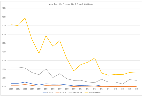
This puts things in a different light, doesn’t it? That slight uptick in AQI data between 2016 and 2018 loses any significance, at least to anyone familiar with statistics, when compared to the much larger fluctuations in years past.
The overall reduction in unhealthy AQI days during President George W. Bush’s terms in office dropped from a high of 7.9 percent of all reporting days (2002) to a low of 3.23 percent (2008), a reduction of 59 percent. On the other hand, the number of unhealthy AQI days shot up during President Barack Obama’s first term in office, from 1.83 percent in 2009 to 3.29 percent in 2012, an 80 percent increase that would have surely earned at least a few tut-tuts among the mainstream media had a Republican been occupying the White House.
Industry can be said to make something of a contribution of emissions of nitrogen oxides and volatile organic compounds (VOCs), which combine to form ozone on hot, windless days. Mobile sources and area sources together now generate more of both pollutants, but the point is moot since ozone exceedances contribute little to AQI unhealthy ratings any longer. Days when monitors recorded ozone concentrations above the 0.070 ppm standard fell to around 0.09 percent of reporting days starting in 2013 and have remained within a couple hundredths of a percent ever since. Days exceeding the 0.075 standard dropped and remain around 0.03 percent of reporting days.
PM-2.5 exceedences have played a much more significant role in calculating AQI. In the benchmark years of 2013 through 2016 that Borenstein and Forster cite, AQI unhealthy days ran at 1.57 percent, 1.33 percent, 1.43 percent, and 1.39 percent of reporting days. This pretty much tracks with PM-2.5 exceedances: 0.87 percent, 0.54 percent, 0.54 percent, and 0.31 percent of reporting days. Bumps in PM-2.5 exceedances in 2017 and 2018 (0.83 percent and 0.73 percent) made expected contributions to AQI unhealthy days in those years (1.63 percent and 1.70 percent).
The bad news for conspiracy theorists is that the vast majority of PM-2.5 emissions have nothing to do with industry, so any imagined “backsliding” at the EPA causing the tiny jump is just plain nonsense. According to the last verified National Emissions Inventory, only about 12 percent of PM-2.5 emissions are generated by industry in the United States. As the EPA correctly stated, wildfires are the biggest contributor to PM-2.5 emissions, with other area sources and mobile sources playing the next largest roles.
Borenstein and Forster’s analysis of the data was fatally flawed from the start, likely I suspect because they followed the unfortunate trend among too many modern journalists of searching for evidence to justify conclusions. Placing such enormous significance on such slight recent variability in AQI is unscientific and unfair.
Trump is absolutely right when he says our air is as clean as it ever has been, at least in the industrialized era. To anyone without an ax to grind and the proper skill-set to do the analysis, the data speaks for itself.
Richard Trzupek is a chemist and environmental consultant as well as an analyst at The Heartland Institute. He is also the author of “Regulators Gone Wild: How the EPA Is Ruining American Industry.”
Views expressed in this article are the opinions of the author and do not necessarily reflect the views of The Epoch Times.