https://inconvenientfacts.xyz/blog/f/mass-extinction-lie-exposed-life-is-thriving
By Gregory Wrightstone
One million species will become extinct in the not-too-distant future and we are to blame. That is the conclusion of a new study by the Intergovernmental Science-Policy Platform on Biodiversity and Ecosystem Services (IPBES). The 1,800 page study was issued on May 6th and warns that “human actions threaten more species with global extinction now than ever before” and that “around 1 million species already face extinction, many within decades, unless action is taken to reduce the intensity of drivers of biodiversity loss.”
It also asserted that we have seen increasing dangers over the last several decades, stating “the threat of extinction is also accelerating: in the best-studied taxonomic groups, most of the total extinction risk to species is estimated to have arisen in the past 40 years.” The global rate of species extinction claimed “is already tens to hundreds of times higher than it has been, on average, over the last 10 million years.”
The release of the report spawned a media frenzy that uncritically accepted the study’s contention that we will see more than 20,000 species per year bite the dust in the not too distant future. PBS called it the “current mass extinction,” and the New Yorker’s headline read “Climate Change and the New Age of Extinction.”

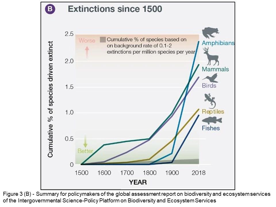
The entire report has not yet been released, but the “Summary for Policy Makers” was made public. The only chart within it that supported the claim of increasing extinctions is shown here (Figure 1). The graph covers 500-years and appears to present a frightening increase in extinctions and extinction rate.
This chart and the accompanying “analysis” are a case study of how those who promote the notion of man-made catastrophic warming manipulate data and facts to spread the most fear, alarm, and disinformation.
First, note that the title of the graph itself (Cumulative % of Species Driven Extinct) is confusing even to scientists used to interpreting such data. More importantly, the data were lumped together by century rather than shorter time frames, which, as we shall see accentuates the supposed increase in extinctions.
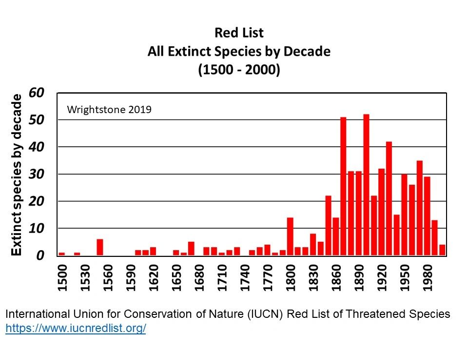
The base data were derived from the International Union for Conservation of Nature and Natural Resources (IUCN) Red List, which catalogues every known species that has gone the way of the dodo and the carrier pigeon. Review of the full data set reveals a much different view of extinction and what has been happening recently.
Below, all 529 species available from the Red List with a known extinction date are shown below in Figure 2 by decade of extinction. This chart reveals quite a different story than that advanced by the new report. Instead of a steady increase in the number and rate of extinctions we find that extinctions peaked in the late 1800s and the early 20th century, followed by a significant decline that continues today. It is thought that this extinction peak coincides with introduction of non-native species, primarily on islands (including Australia).

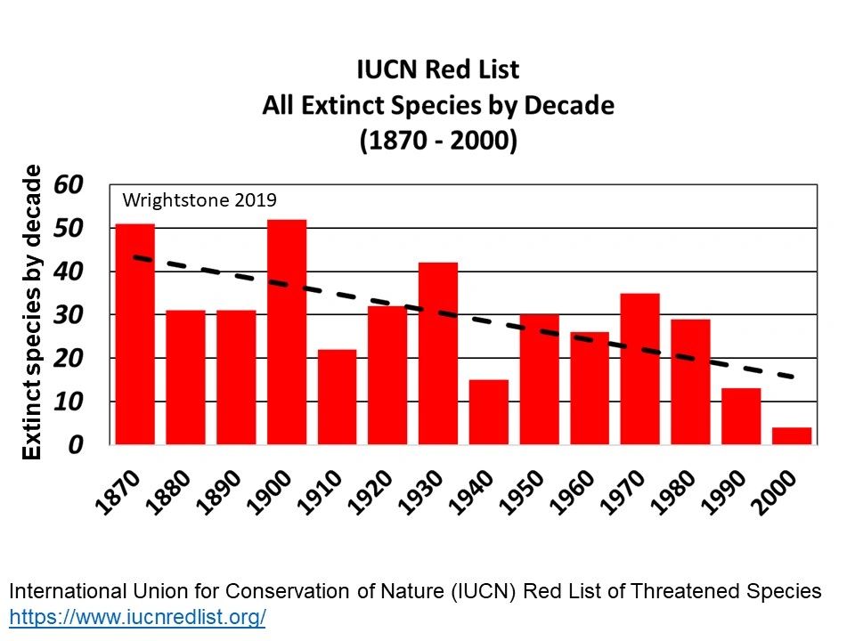
A closer review of the most recent information dating back to 1870 reveals that, instead of a frightening increase, extinctions are actually in a significant decline.
What is apparent is that the trend of extinctions is declining rather than increasing, just the opposite of what the new report claims. Also, according to the IPBES report, we can expect 25,000 to 30,000 extinctions per year, yet the average over the last 40 years is about 2 species annually. That means the rate would have to multiply by 12,500 to 15,000 to reach the dizzying heights predicted. Nothing on the horizon is likely to achieve even a small fraction of that.

This new extinction study is just the latest example of misuse and abuse of the scientific process designed to sow fear of an impending climate apocalypse. The fear and alarm over purported man-made catastrophes are needed to frighten the population into gladly accepting harmful and economically crippling proposals such as the Green New Deal.
Rather than an Earth spiraling into a series of climate catastrophes that threaten the planet’s life, we find that our planet and its estimated 8 million species are doing just fine, thank you.
Postscript: In an incredibly ironic twist that poses a difficult conundrum for those who are intent on saving the planet from our carbon dioxide excesses, the new study reports that the number one cause of predicted extinctions is habitat loss. Yet their solution is to pave over vast stretches of land for industrial scale solar factories and to construct immense wind factories that will cover forests and grasslands, killing the endangered birds and other species they claim to want to save.
Gregory Wrightstone is a veteran geologist and author ofInconvenient Facts: The Science that Al Gore Doesn’t Want You to Know


