A visitor to Cornwall Alliance’s Facebook page recently asked our thoughts on a new video from NASA purporting to demonstrate that global warming is happening rapidly and that there’s been no slow-down, let alone “pause,” in the last two decades. Among other media, Huffington Post featured the video in an article titled “NASA Climate Change Video Shows Just How Quickly the Earth Is Warming.”
As is typical, the video uses frightening graphics to communicate numbers that are far less than frightening:
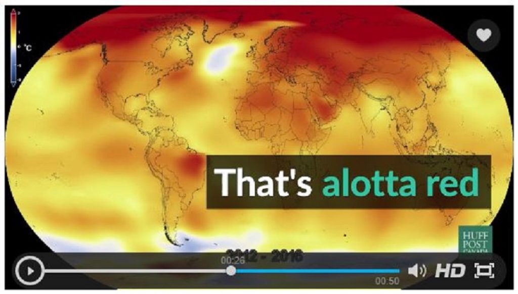
Of course, we’re all accustomed to seeing redness on severe burns and on hot stove burners and oven heating elements. Red means hot-hot-hot! Little does the typical viewer recognize that the entire increase in global average temperature over the period from 1880 to the present is estimated at roughly 1C—a small fraction of the typical difference between low and high readings on a single day in most locations, and a much smaller fraction of the typical difference between winter low and summer high in most locations. Consider what happens to the psychological effect if the picture is rendered in grayscale instead of the shocking reds and yellows:
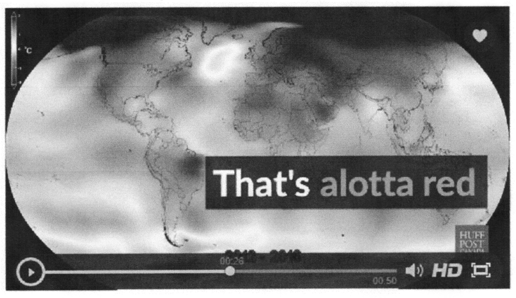
There’s a lesson in how graphics can be used for psychological manipulation.
The video of course only pictures the numbers fed into it, and the “adjustments” being made over the last three years or more by both NOAA and NASA to their surface temperature “data” are highly suspect because the criteria by which they’re made, the computer codes that apply the criteria, and the whole path of the adjustment process have not been made public and thus aren’t testable/replicable by other scientists. Replicability is the hallmark of sound scientific research. The actual outcome of the adjustments is clear, though: “temperatures” in the early overall period are pushed downward, and “temperatures” in the later part are pushed upward.