Via: https://kenskingdom.wordpress.com/2016/08/07/the-pause-update-july-2016/
The Pause Update: July 2016
The complete UAH v6.0 data for July were released on Friday. I present all the graphs for various regions, and as well summaries for easier comparison. The Pause still refuses to go away, despite all expectations.
These graphs show the furthest back one can go to show a zero or negative trend (less than 0.1 +/-0.1C per 100 years) in lower tropospheric temperatures. I calculate 12 month running means to remove the small possibility of seasonal autocorrelation in the monthly anomalies. Note: The satellite record commences in December 1978- now 37 years and 8 months long- 452 months. 12 month running means commence in November 1979. The y-axes in the graphs below are at December 1978, so the vertical gridlines denote Decembers. The final plotted points are July 2016.
[CLICK ON IMAGES TO ENLARGE]
Globe:

The Pause is 3 months shorter.
And, for the special benefit of those who think that I am deliberately fudging data by using 12 month running means, here is the plot of monthly anomalies, which shows that The Pause is over by my rather strict criterion:

+0.33C/100 years since December 1997- not exactly alarming. The Pause will return sooner with monthly anomalies than 12 month means of course.
Northern Hemisphere:
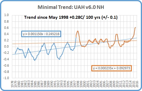
The Northern Hemisphere Pause has ended as expected. Note the not very alarming warming of 0.28 +/- 0.1C per 100 years for half the record compared with 1.38C for the whole period.
Southern Hemisphere:

The Pause has shortened by another 4 months, but still, for well over half the record, the Southern Hemisphere has zero trend.
Tropics:

The Pause has shortened by another 2 months with the El Nino influence, but is still over half the record.
Tropical Oceans:

The Pause has shortened by another 3 months- the El Nino now having a strong effect on the 12 month means.
Northern Extra Tropics:

The Pause by this criterion has ended in this region, however note that the slope since 1998 is +0.34 +/- 0.1C per 100 years compared with +1.6C for the whole period. That’s still embarassingly slow warming.
Southern Extra Tropics:

The Pause has lengthened again by another month.
Northern Polar:

The Pause has decreased by 1 month.
Southern Polar:

The South Polar region has been cooling for the entire record- 36 years 9 months.
USA 49 States:

The Pause is 2 months shorter.
Australia:

The Australian Pause is one month longer.
The next graphs summarise the above plots. First, a graph of the relative length of The Pause in the various regions:

Note that the Pause has ended by my criteria in the Northern Extra Tropics and the Northern Hemisphere, but apart from the North Polar region, all other regions have a Pause for over half the record, including the South Polar region which has been cooling for the whole record.
The variation in the linear trend for the whole record, 1978 to the present:

Note the decrease in trends from North Polar to South Polar.
And the variation in the linear trend since June 1998, which is about halfway between the global low point of December 1997 and the peak in December 1998:

The only region to show strong warming for this period (18 years 2 months) is the North Polar region: the Northern Extra Tropics, Tropics, the Northern Hemisphere, and the Globe have very mild warming but all other regions (including all of the Southern Hemisphere) are Paused or cooling. The imbalance between the two hemispheres is obvious. The lower troposphere over Australia has been strongly cooling for more than 18 years- just shy of half the record.
And finally, here is a plot of Global UAH versus CO2 concentration at Cape Grim from January 1996 to June 2016:

Now that’s a Pause!