By P Gosselin on 28. April 2017
German meteorological and climate site Schneefan (snow fan) here writes on the recent changes by the DMI on its Greenland ice mass chart. Personally I wouldn’t be surprised if this were in part due to climate data embarrassment.
Schneefan writes that the Danish Meteorological Institute (DMI) recently changed the reference period for showing the Greenland ice mass: from the warmer 1990-2013 to the internationally usual but colder WMO climate period of 1981-2010.
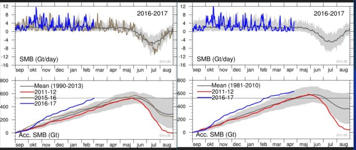
The change over to the WMO-recommended older and colder reference period has the effect of making the massive ice growth of the past two years with respect to the new mean look smaller, as the current comparison shows (lower chart).
Top: The total daily contribution to the surface mass balance from the entire ice sheet (blue line, Gt/day). Bottom: The accumulated surface mass balance from September 1st to now (blue line, Gt) and the season 2011-12 (red) which had very high summer melt in Greenland. For comparison, the mean curve from the period 1981-2010 is shown (dark grey). The same calendar day in each of the 30 years (in the period 1981-2010) will have its own value. These differences from year to year are illustrated by the light grey band. For each calendar day, however, the lowest and highest values of the 30 years have been left out.“ Source: http://www.dmi.dk/surface-mass-budget/.
By changing the comparison period in April 2017 from 1990-2013 to the older and colder WMO 1981-2010 climate period, the mean shown by the gray line and shaded area is raised. This is illustrated by the thin black lines I’ve added to the two lower charts showing the old mean peak value. Using the 1990-2013 period, the mean peak value was about 550 gigatonnes.
Today using the older and colder WMO 1981-2010 the mean yearly peak rises to about 600 gigatonnes. As a result the current curve shown in blue the strong ice growth during September 2016 becomes less apparent. Moreover, the strong 2015/16 ice year year has been left out (brown curve in the old chart, left).
Foremost by leaving out the strong 2012 melt year (red curve in lower chart), which acted to significantly pull down the 1990-2013 ice mass, and by extending the chart out nine years into the colder past (from 1990 to 1981) the new 1981-1990 mean is considerably higher than the old one: Honi soit qui mal y pense…
– See more at: http://notrickszone.com/2017/04/28/danish-meteorological-institute-moves-to-obscure-recent-record-greenland-ice-growth/#sthash.cuDmsnQq.dpuf


